


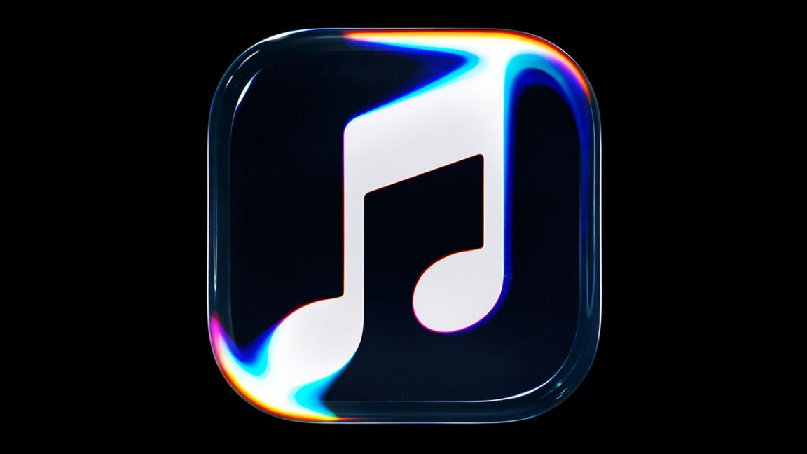
Apple Music’s New Rebrand Uses Liquid Glass, Sound, and Mineral Oil
Apple has announced a new brand identity for Apple Music, including an expected move toward its liquid glass design language. I’m generally not a fan of Apple’s newest visual style. I’m still running macOS Sequoia, after all, and I have some grumpy opinions about rounded corners and text readability.
Design trends come and go. If a new interface begins to affect your ability to work—or, more importantly, prevents you from receiving security updates—you’ll eventually upgrade. Once you get used to the changes, they may not bother you as much.
Apple Music’s Behind-the-Scenes Rebrand Video
That’s why I usually wouldn’t give an obvious rebrand much attention. But after Apple’s behind-the-scenes video appeared in my YouTube recommendations, I realized there was more to the Apple Music redesign than a new logo.
The clip is just over a minute long, so you can watch it here:
How Apple Created the New Apple Music Identity
Let’s get the obvious out of the way: This is Apple at its best. A company with a $5 trillion market capitalization has enormous resources available to solve almost any creative or technical problem.
For the Apple Music rebrand, Apple worked with design company TBWA/Media Arts Lab and pop hit-making music producer Fred—“aka Fred,” as he spells it. The production also involved a fully staffed set with cameras and lights, along with mineral-oil tanks fitted with transducers that sent audio signals into physical ripples.
The team filmed large amounts of oil, selected for its high viscosity, interacting with Apple Music branding printed on transparent panels. The result is a visual identity that connects the science of sound with Apple’s liquid glass-inspired design language.
Fast Company has a detailed breakdown if you want to learn more about the design process. We’ll explain the technical aspects in greater detail as well.
Source: arstechnica.com