


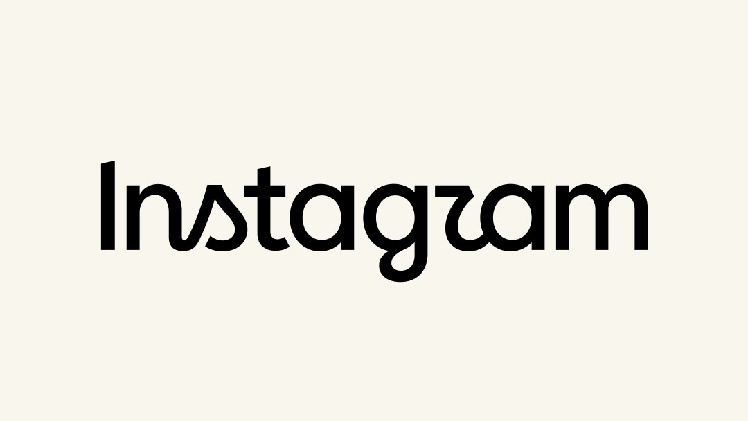
Instagram has unveiled a redesigned wordmark for 2026, giving the social media platform’s familiar logo typography a cleaner, more modern appearance. As usual, the announcement is accompanied by polished corporate language about simplicity, creativity, and craftsmanship.
Adam Mosseri, Head of Instagram, described the redesign by saying, “It takes cues from the original, but is leaner and more modern, with a sense of simplicity and craft that always graces Instagram.”
“Simplicity and craft” may not be the first phrases that come to mind when thinking about Instagram. The platform is more commonly associated with algorithm-driven content, constant influencer trends, aggressive engagement strategies, and the collection of personal data for targeted advertising.
But branding is branding.
Instagram’s previous wordmark had been in place for roughly a decade, and the 2026 update arrives as the company continues to refine its visual identity. I do not usually spend much time analyzing corporate logo redesigns, but the new Instagram wordmark is difficult to ignore.
The first question many people will likely ask is simple: Why does the redesigned logo appear to say “Instagzam”?
Source: arstechnica.com