


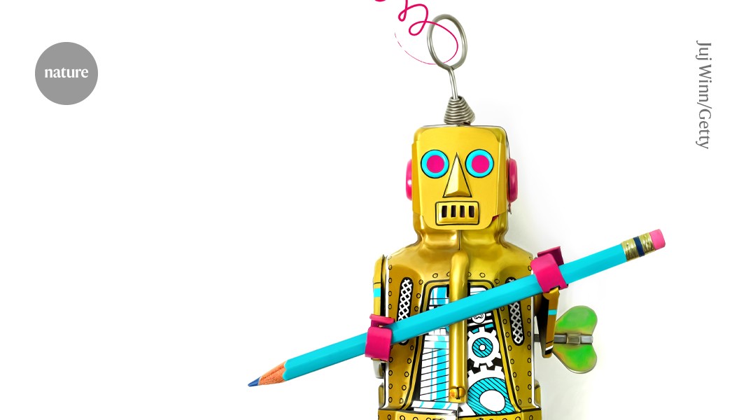
Artificial intelligence tools can create attractive and clear graphical summaries of research papers by using well-crafted prompts.
Credit: Juj Winn/Getty
A well-designed graphical summary serves as one of the most effective tools for communicating your invaluable research findings. It enhances memorability, accessibility, and engagement for diverse audiences, ranging from field experts to interested readers outside of academia.
Creating a clear graphic summary can be challenging, especially when graphic designers or design software are not accessible. However, leveraging artificial intelligence tools, when used thoughtfully, can significantly bridge this gap.
3 Tips to Avoid AI Image Mistakes in Science
Before the advent of AI, I invested significant time contemplating the do’s and don’ts, selecting tools, and initiating the design process for graphical summaries. Now, with AI, brainstorming ideas is effortless through voice-to-text features, sketch vectorization, color palette optimization for accessibility, and tailored workflow tools.
However, with this convenience comes the obligation to ensure scientifically accurate images that respect intellectual property rights. AI-assisted graphics will carry your name as the creator, making it crucial to verify authenticity and originality.
So, how can you produce high-quality graphical summaries by responsibly and effectively integrating AI? Below are some key lessons I’ve gathered.
Think Before You Start
First, review the submission guidelines of your target journal regarding AI usage. Some journals restrict AI-generated images, while others necessitate clear disclosure.
If permitted, the next step is to clarify your communication objectives. Will you depict mechanisms, experimental setups, comparisons, workflows, or timelines? For instance, a crucial message in one of my studies focused on how deubiquitinating enzymes contribute to obesity-related liver issues, pinpointing where enzyme inhibitors can halt disease progression.1 Resultantly, instead of detailing every molecular interaction, a graphical summary (created without AI) was fashioned to illustrate these enzymes’ role in disease progression through a single representative pathway. This approach aimed to provide sufficient context, making the mechanism intuitive and engaging while allowing room for readers to delve into molecular specifics in a complete study.

Ananya Thakur leverages AI tools to brainstorm ideas for graphic summaries.
Credit: Mikko Törmänen/University of Oulu
Next, consider your target audience: Are they clinicians, industry professionals, policy makers, students, or field experts? Understanding your audience will guide you in determining the appropriate level of detail, terminology, and visual complexity. Academic readers may focus on biochemistry, while clinicians are more interested in clinical implications like inflammation and insulin resistance. Tailor your summary to highlight the aspects of your research that resonate most with your audience.
“Good Design Requires Skill”: A Scientific Illustrator Envisions the Future of AI
Lastly, turn to the literature for inspiration. Investigate how similar papers present graphical summaries, looking at both content and organization. Which examples are effective and why?
AI can enhance your brainstorming efforts. Tools such as ChatGPT (OpenAI, San Francisco, CA) and Claude (Anthropic, San Francisco) can help distill key research messages, identify relevant studies, and enhance reader comprehension. Additionally, AI tools can propose graphical representations for abstract concepts such as multi-omics and system-level interactions.
Communicate with Design
The effectiveness of an AI-generated graphic is contingent upon how clearly the idea is communicated in the prompt. Focus on making intentional choices regarding visual elements such as:
Color: Selecting colors based on psychological associations can make abstract depictions more intuitive. For example, red and orange colors are often used to signify important interactions or dangerous elements like cancer cells, while blue and green tend to indicate normal or healthy states.
Celebrate natureCovers — Past, Present, Future
However, remember that less is more; an overload of colors (or shapes) can lead to confusion. Aim for a cohesive, high-contrast palette that remains consistent throughout.
Ask your AI tools: What colors should I use for color accessibility against specific backgrounds? Or how should I visualize a specific pathway for a particular cell type?
Composition: Determine whether a horizontal or vertical flow, circular loops, or branching paths would best suit your message. Each configuration guides the viewer’s gaze differently. Effective composition directs the audience’s attention in the desired direction.
Ask the AI tool: This is a graphic summary of my research. Can you suggest alternative structures? What alternative text placements would you recommend?
Source: www.nature.com